


Branding
For the Australian Space Agency’s newest rebrand, we looked to the stars.
Australia’s Indigenous people are essentially the world’s oldest astronomers. For thousands of years the sky has been critical in dictating seasonal activities around food and movement, and a reflection of what is happening on the land.
At first glance, the logo appears as a satellite view of Australia. The dots alluding to the light created from human life and industry, which the Agency will support. But hidden within the dots are several significant Indigenous constellations that can be seen if we look up across Australian skies.
Role: Typographer
The palette was inspired by natural, earthy tones associated with Indigenous culture, whilst the wordmark – a modified HK Grotesk – was chosen to allude to the coming together of both the past and the future.
We also created an animated video that tells the story of the Australian Space Agency’s new brand identity.
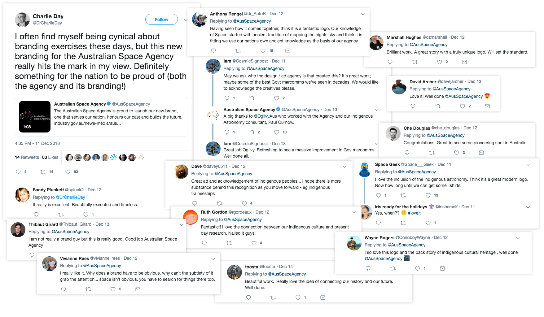
Response to the rebrand has been overwhelmingly positive, with appreciation going to the double-meaning of the logo and the consideration of Indigenous communities.